There are so many factors that go into how you feel in a given day. How you’ve slept, what you’ve eaten, how much coffee you’ve had, or haven’t (everyone knows the RWD Team requires a lot). Not to mention personal matters and stressors from work, which is why your home should be a safe and calm place to be, to relax and release all the stress, worries, and everything else that frankly makes us grumpy. Just as there are several factors that go into making us feel bad, there are also several that can help us feel good. The color of your space is one of them!
This concept is referred to as Color Psychology which is a theory of how colors can affect a person’s feelings and mood which trickles down to affect their whole life. Different hues of each color have different effects on the human brain. You may find you need a color palette that increases energy, or one that brings calmness to your space, maybe a mix of both. So let’s take a look at how each color affects you and your mood!
RED
A bold, bright, and romantic color. Red is one of the primary colors that is associated with energy, romance, strength, willpower, desire, and love. It has been known to increase respiration rate and raise blood pressure, while attracting attention more than any other color. Red is perfect in spaces you need to stand out and be productive in.
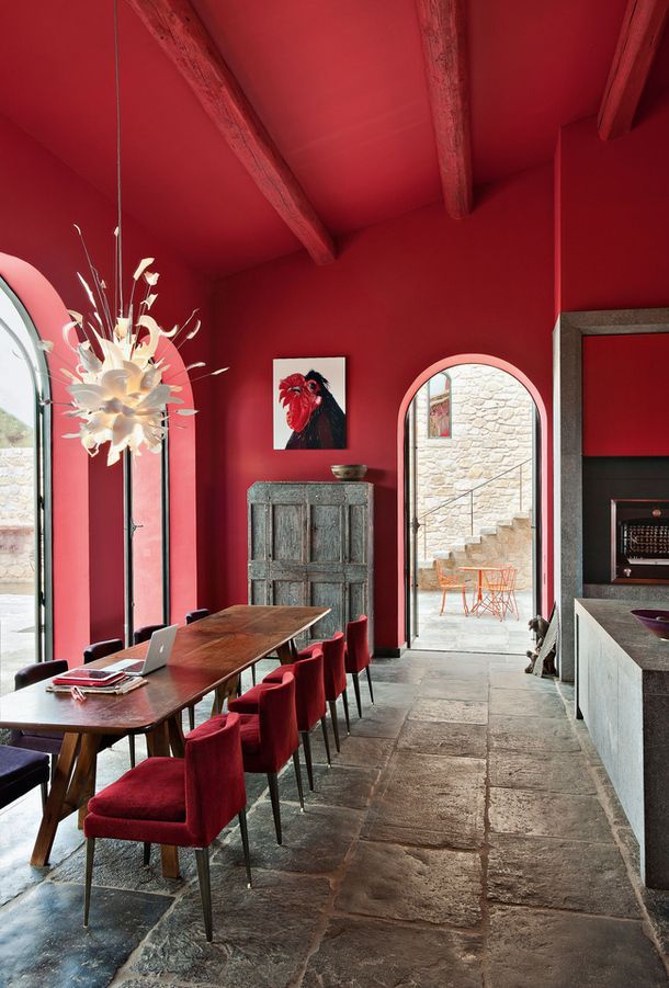
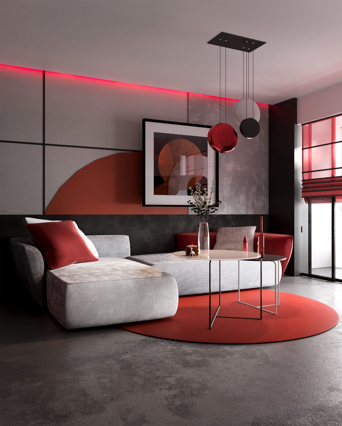 Image Source 1 | Image Source 2
ORANGE
Take some yellow and red and BOOM you have orange. A lovely bright and persuasive color that promotes optimism and cheerfulness. Orange is a comfortable color to be surrounded by, promoting positivity and allowing oneself to feel free enough to express themselves. It is a color associated with joy, sunshine, and happiness. Orange would be great in spaces you desire to feel your best in, to relax, and be at peace with who you are.
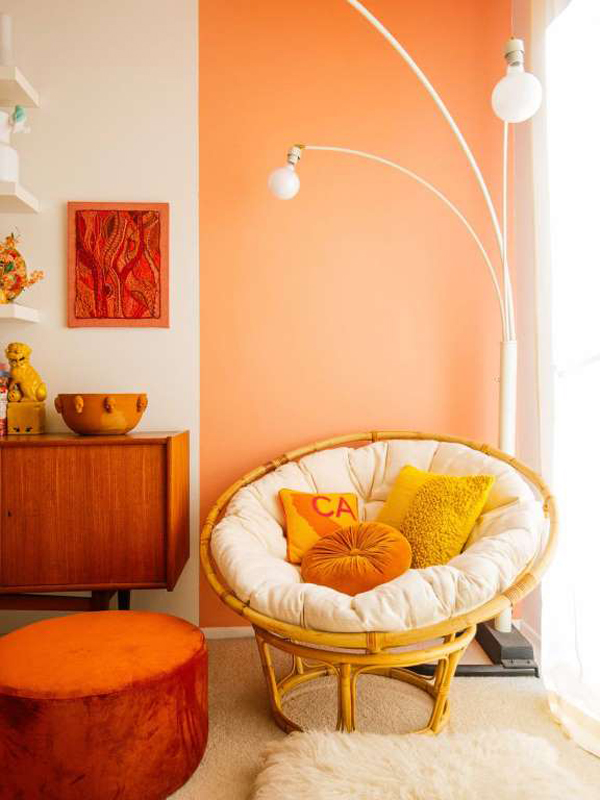
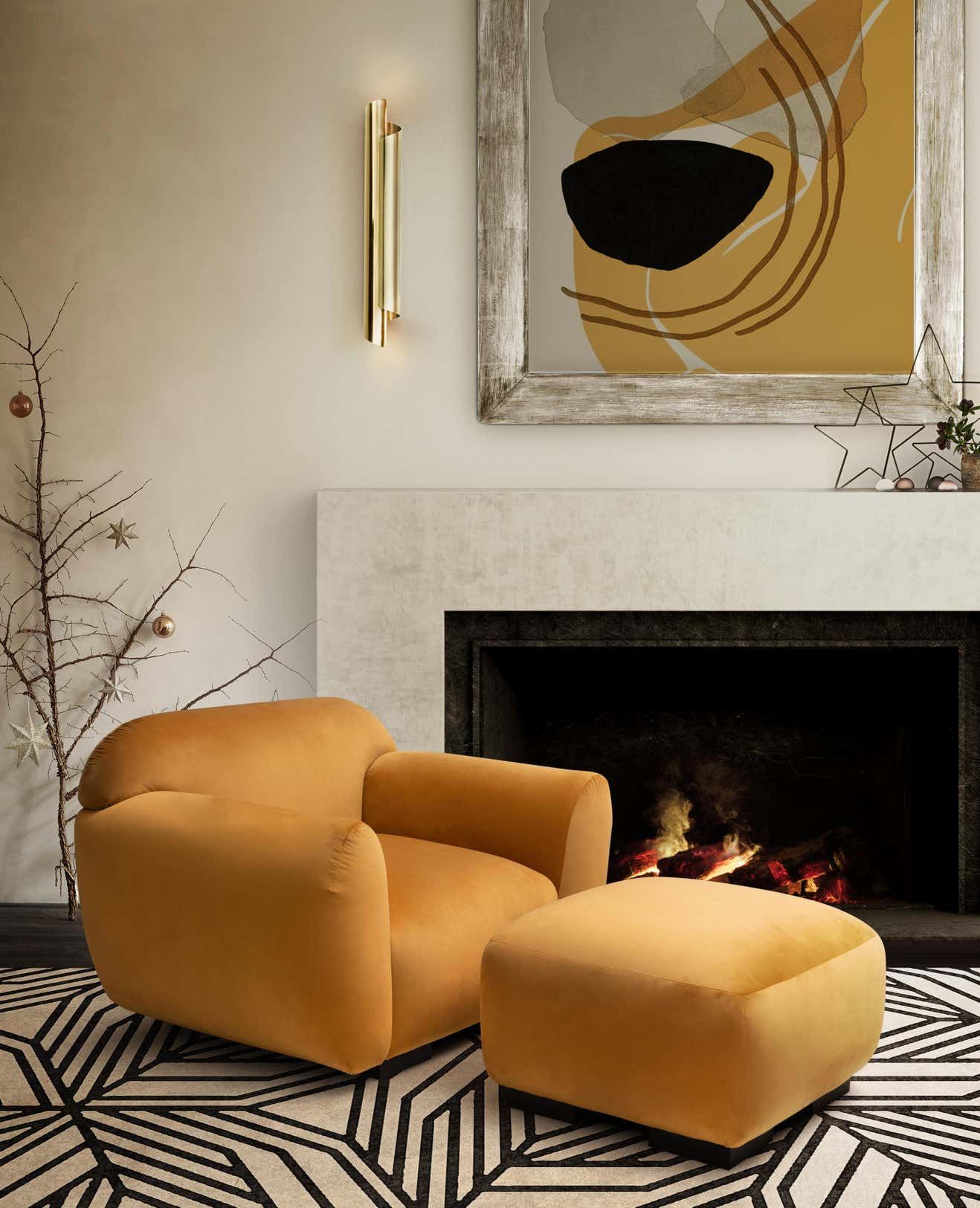
Image Source 1 | Image Source 2
YELLOW
The brightest of all colors, yellow is a color that promotes inspiration, energy, and joy. Although, too much yellow can present a disturbing effect that causes an overwhelming feeling, making it best to use in moderation. Add a splash of yellow in rooms you may not spend the majority of your time in, but you visit most often such as kitchens, hallways, and bathrooms.

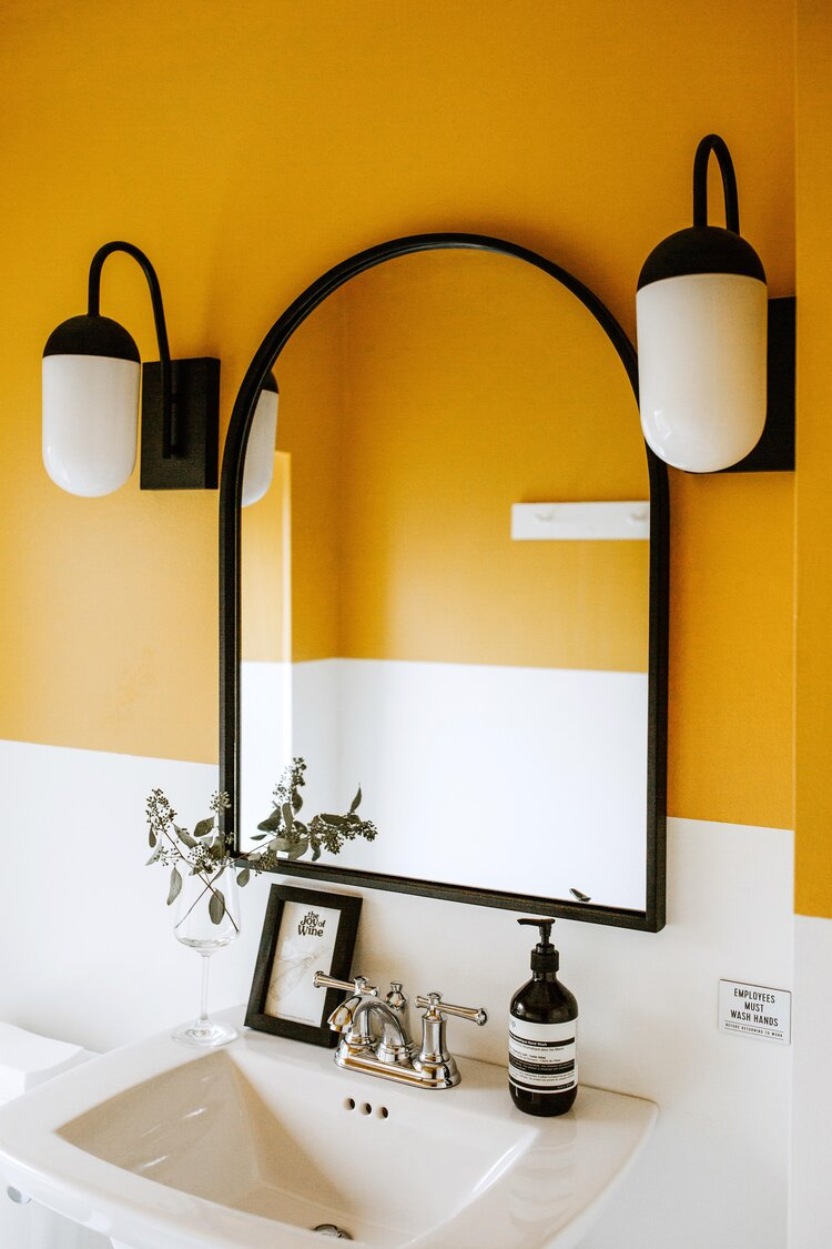
Image Source 1 | Image Source 2
GREEN
Green is a primary color that connects us most to nature. Having a green space can promote feelings of health, freshness, and growth. Green in spaces such as bedrooms, living rooms, or any other gathering room can present a feeling of calmness and grounding.
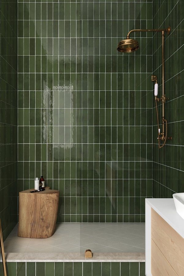
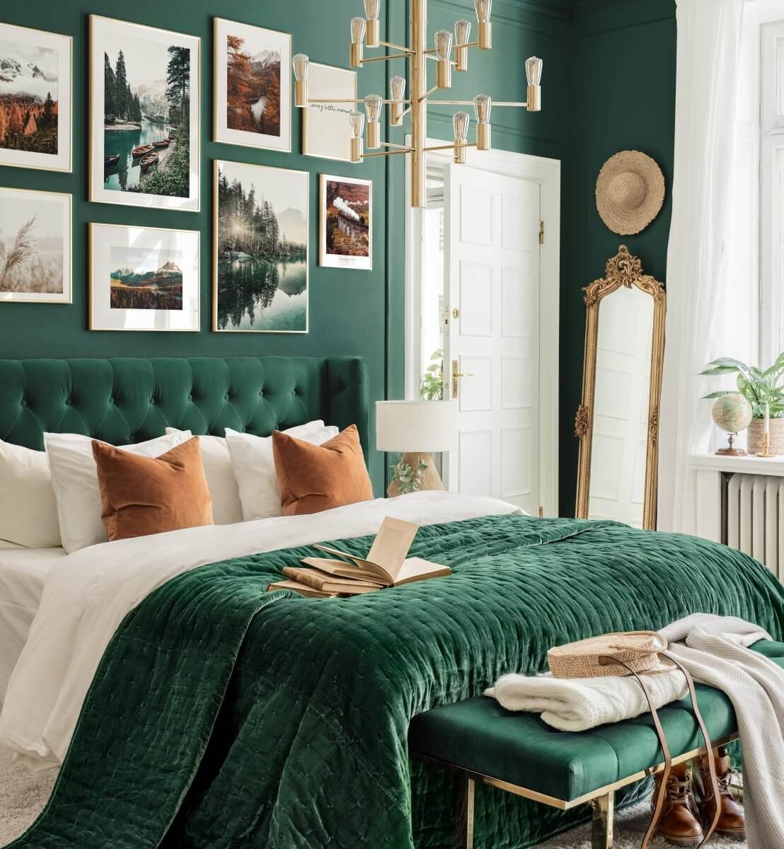
Image Source 1 | Image Source 2
BLUE
Blue embodies almost the exact opposite feeling that Red does. Ensuring feelings of inner reflection, sympathy, and peace. A blue room is destined to provide relaxation and calmness and is typically the safest color to use in any room.
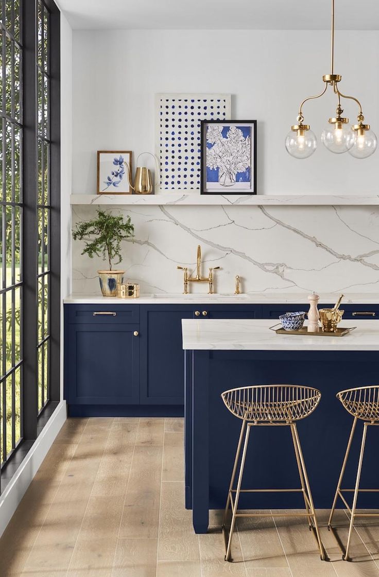
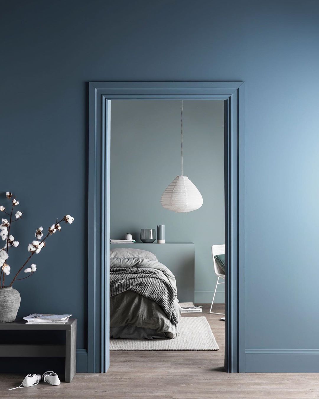
Image Source 1 | Image Source 2
PURPLE
Historically associated with luxury and power, it is more common to be associated with royalty and nobility. With blue tones, purple brings a sense of relaxation and stability. This color works beautifully in areas that inspire creativity and design.
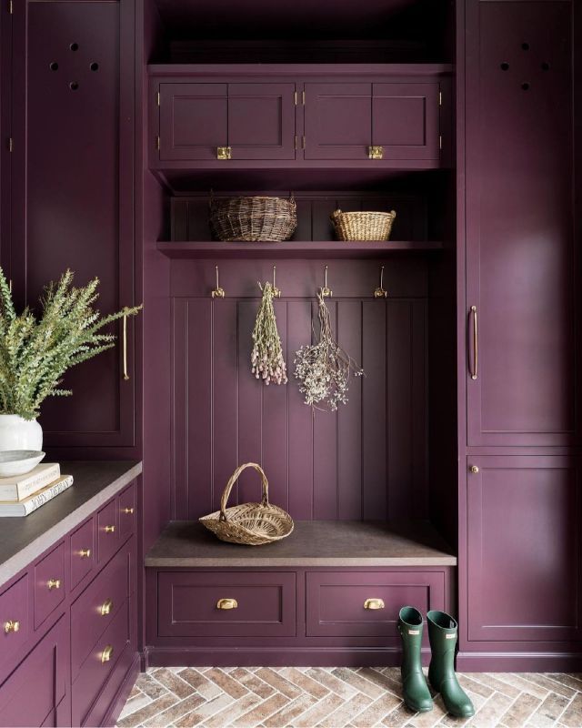
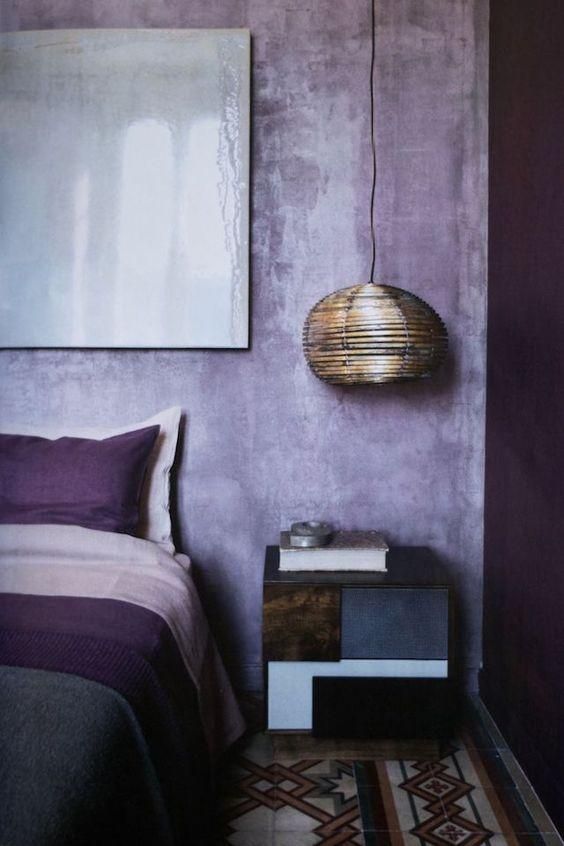
Image Source 1 | Image Source 2
PINK
Pink is a color very close to red, as it can be achieved by mixing red and white together. It can represent gently love, vulnerability, and femininity. A kind color to have in any space to create an atmosphere of love and kindness.
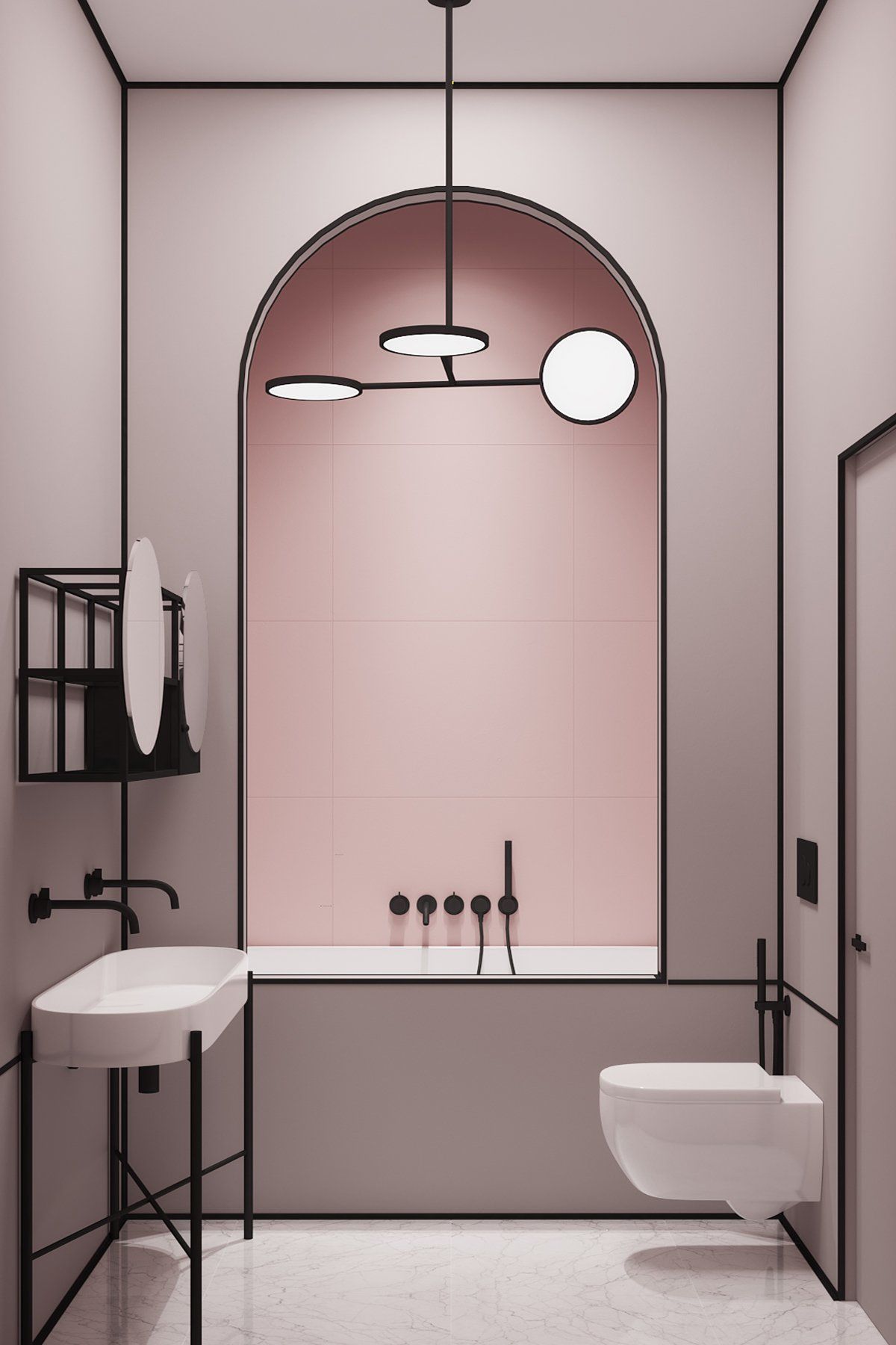
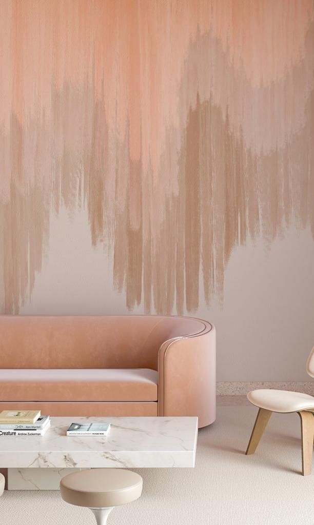
Image Source 1 | Image Source 2
Of course there is no “right or wrong” color to fill your space with, you can even fill it with all of them! Whether your home is full of life and several colors, all one color, or none at all, it should reflect who you are and provide a space you feel most comfortable in to be your most authentic self.
XOXO,