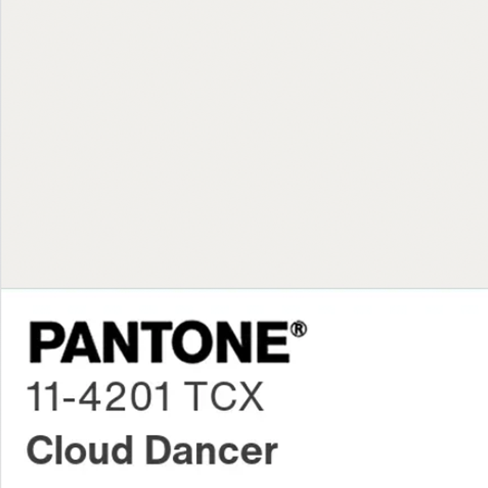
Every year, we wait with bated breath to hear what Pantone’s Color of the Year is. It’s always fun to see their prediction of what color will be influencing the world of design, and we are often surprised by their choice, but this year, we were completely blown over by the choice. White. Well, technically it’s “Cloud Dancer”, but it’s a white. We compared the color to the white paint colors we like to use on projects, and it is almost a pure white…
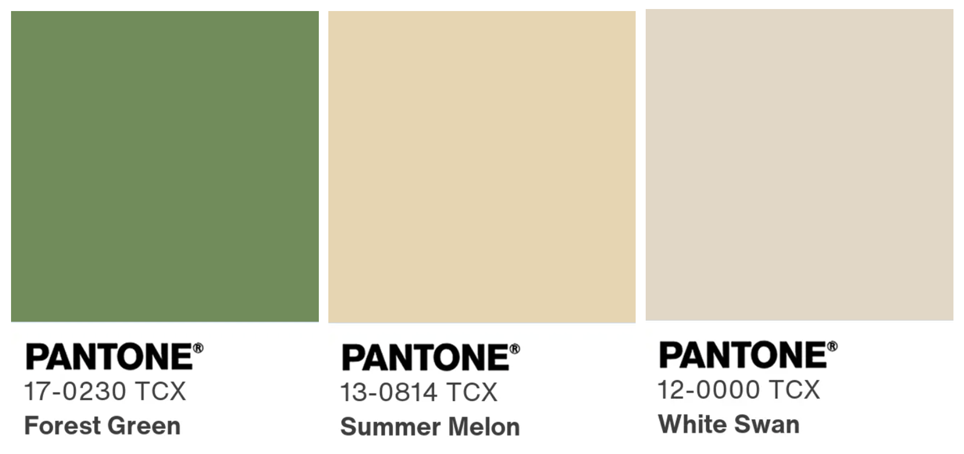
White is fine. We get what they were going for – a new start, a blank page, and a breath of fresh air. However, 2025 was a hard year for many, and white feels a little sad. We would have chosen something more vibrant, something with a little more life to it. A fresh green, such as Forest Green, would also give a “breath of fresh air” feeling, but with more hope to it. A yummy butter yellow would also do that trick, like Summer Melon, and if we were to choose a neutral, we would have gone with something with more pigment, like White Swan.
With the whole world of color in front of you, we think it is time to move past white and into something different… something that makes you think of the sunshine. That is our hope for 2026!
To learn more about Cloud Dancer on the Pantone website, click here. Let us know what you think! Do you love Cloud Dancer, or would you have gone a different direction?
XOXO,